




lino print attempts, eventually settling on a mix between illustration and lino
Mistwood
Cider label & branding design
Mistwood
Cider label & branding design
Mistwood
Cider label & branding design


aim
Design a beer label series for Cloudwater, capturing the brewery’s focus on nature and seasonal ingredients through imaginative, abstract visuals.
solution
Each label features a surreal collage of tiny people interacting with oversized plants, using colour and activity to reflect each season.
I then elevated this by creating new versions using hand-drawn illustrations and lino printing to explore different styles. I stuck to the imagery to convey the seasonal theme, changing the colour schemes to match the colours of the ingredients of each drink, in order to make them more recognisable to returning buyers.


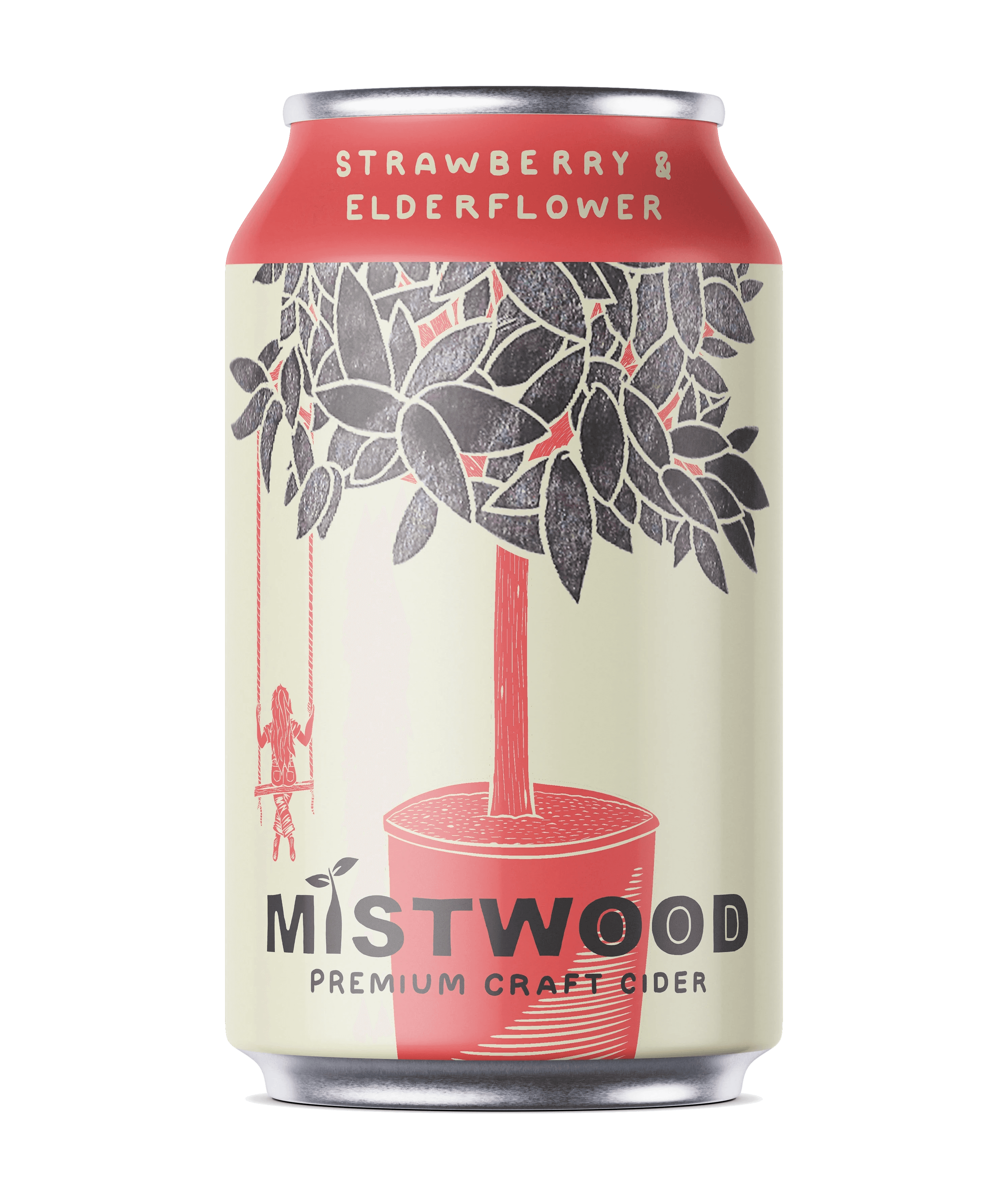

illustration and colour scheme experimentation
illustration and colour scheme experimentation
illustration and colour scheme experimentation
finalised designs & mockups
finalised designs & mockups
lino print attempts, eventually settling on a mix between illustration and lino
lino print attempts, eventually settling on a mix between illustration and lino


first refined designs
first refined designs
first refined designs

initial sketches
initial sketches


aim
Design a beer label series for Cloudwater, capturing the brewery’s focus on nature and seasonal ingredients through imaginative, abstract visuals.
solution
Each label features a surreal collage of tiny people interacting with oversized plants, using colour and activity to reflect each season.
I then elevated this by creating new versions using hand-drawn illustrations and lino printing to explore different styles. I stuck to the imagery to convey the seasonal theme, changing the colour schemes to match the colours of the ingredients of each drink, in order to make them more recognisable to returning buyers.