
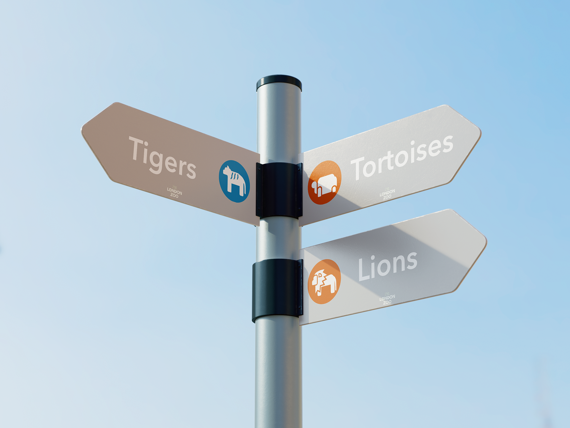
Inspired by negative space and silhouette art, these ZSL London Zoo (fictional brief) animal icons were made to be easily identified from a distance through highlighting the animal’s
significant features.
significant features.

Initial design iterations

Design process of the tiger icon, altering it for enhanced visibility and consistency with the other icons

Finalised icon designs
Each design features consistent spacing between the animals' limbs and features. As well as this, all animals include predominantly rounded edges to appear more friendly and cater more toward the family oriented target audience.


Rollouts for ZSL London Zoo merchandise featuring the animal icons